
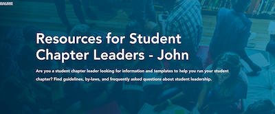
Node Hero
A hero is used to bring attention to the title of a page. The hero can be shown with or without an image. And the the image can show to the side or as a background image.
Examples
Node Heroes on Conferences
Node heroes are also used on conferences, where they are slightly different. They display the conference name, date, venue, and below a separator, a list of hero links. Node hero panes are automatically added to all conferences but the concept of changing the style is the same as a hero.
Watch video to learn how to add a node hero:
Custom Hero
Custom heros are used on pages, not conferences. A custom hero has all the same components as a node hero, but it also includes links or anchors in a CTA or 'call to action' list to make navigation easer. These links appear at the bottom of the hero.

Example
Watch video to learn how to create a custom hero:
Promo Breaker
A promo breaker is used to promote or draw attention to something important having to do with the site it's used on.

Promo Breaker Recommended Character Limits
- Title: 106 characters
- Body: Best: 200 characters Max for 2-column: 300 characters
- Link: 22 characters
Example
Watch video to learn how to add a promo breaker:
Top Reasons to Attend (example of 2-column promo breaker)
- One Line Up to 41 characters for one line
- Max 6 reasons can be used
- Two Lines can use up to 78 characters and stay on two lines
- Better to use even number of bullets
- Code <ul class="u-two-column-text"> in source code.
- Don't repeat the same ideas in various bullets
Quote Breaker
A quote breaker is used to draw attention to an individual's quote or remark. These quotes are generally a positive statement relating to the subject matter of the page.

Recommended Character Limits and Assets
- Body text: 100 – 200 characters or 15-30 words
- Citation: Include name, title, organization
- Photo: Optional but recommended
Example
Watch video to learn how to add a quote breaker:
Collapsible box (Accordian)
Collapsible boxes are used when there are large amounts of copy like lists of terms or frequently asked questions. It condenses the copy into expandable boxes which makes it easier for the user to read and navigate.

Example
Watch video to learn how to add collapsible boxes:
Card Lists
The card list pane allows the user to easily navigate to a part of the website, page, or a file. It also calls attention to that content. There are a few different types of card lists available to use. See examples below.

Examples
Watch video to learn how to add card lists:
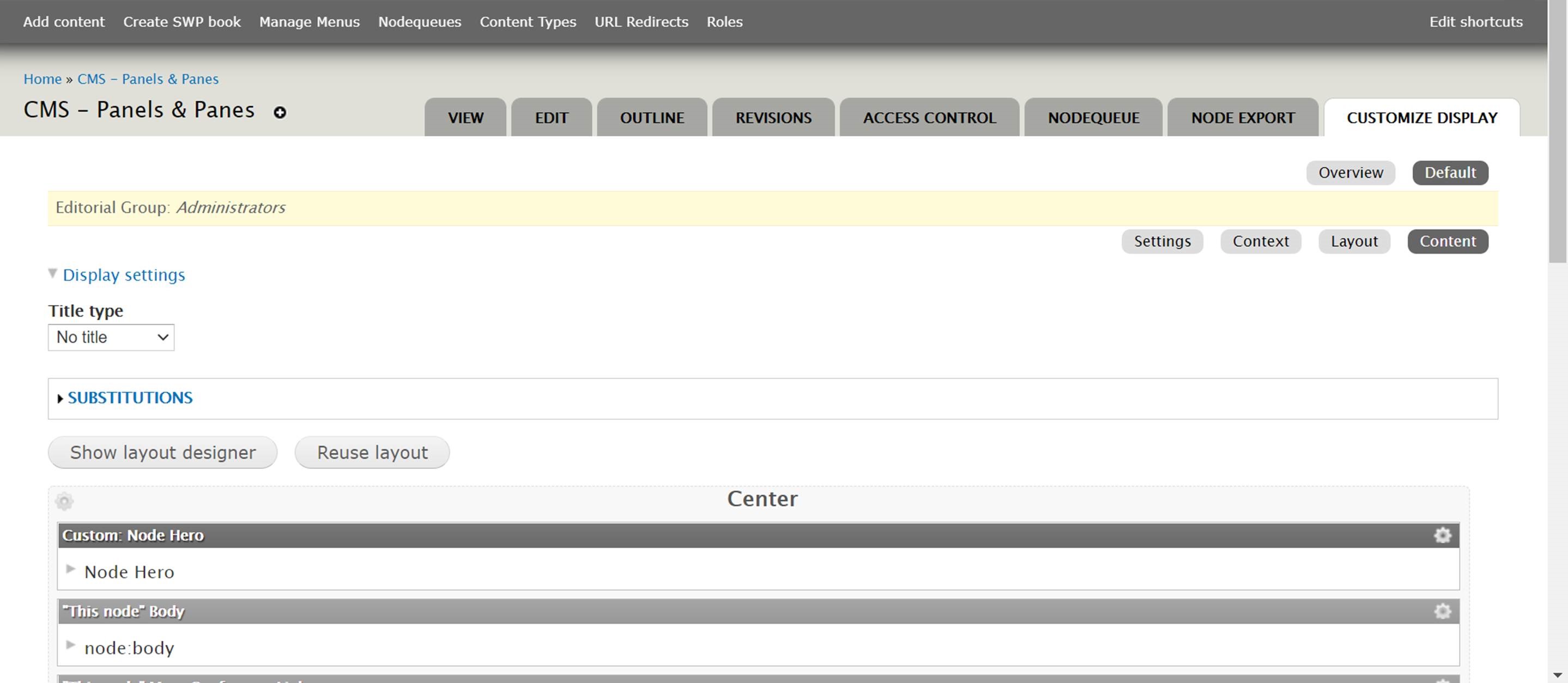
Using Customize Display to hide or reorder panes
When adding new panes, you may need to reposition or hide them for various reasons. You can do this through the 'Customize Display' button in the editor.
Watch video to learn how to hide or reorder panes using Customize Display:
Video Pane
The video pane is used when there is a particular video in relation to your page that you want to highlight. It's a great way to keep your page engaging and exciting for users.

Example
Watch video to learn how to add a video pane:
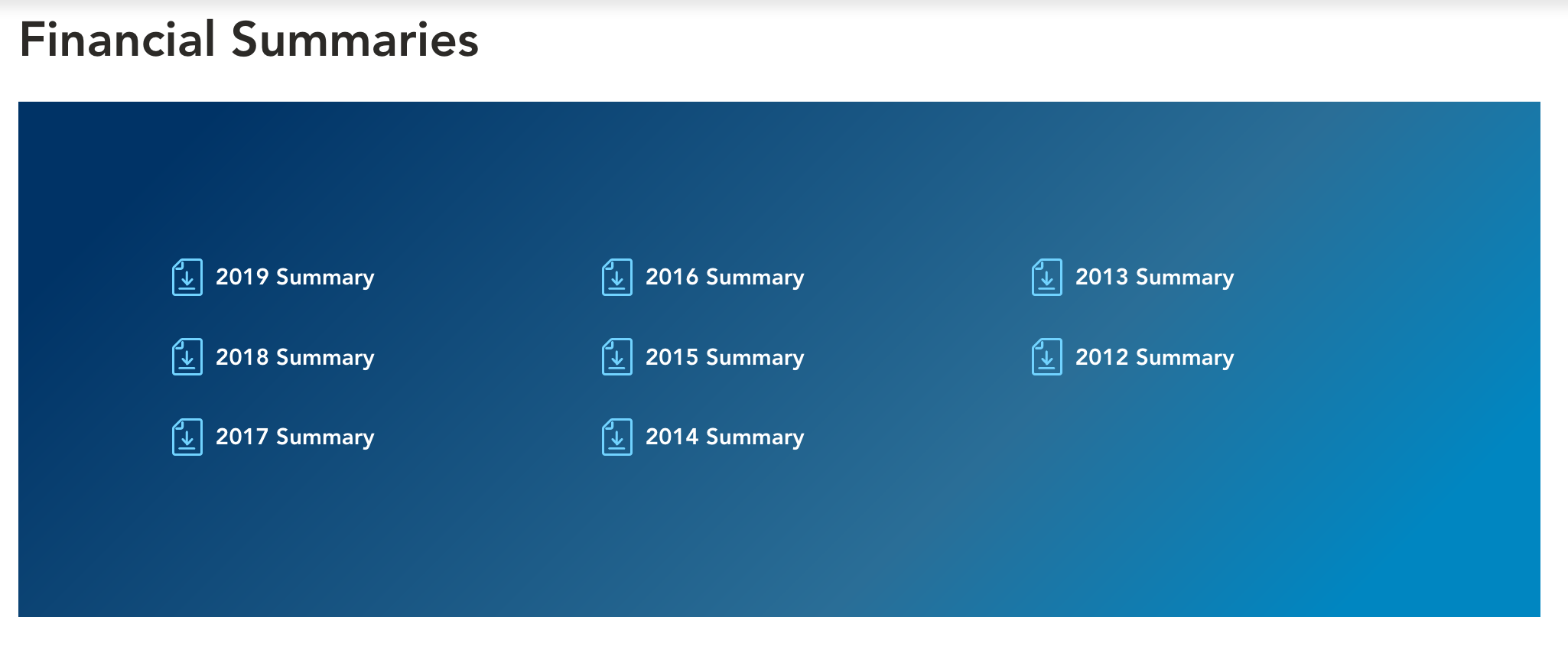
Download List
This pane is used for grouping files in a download list. It's an organized way to display many links to files.
Example
Watch video to learn how to add a download list:
Featured Content Panes
Featured content panes are used to highlight specific content you'd like featured on your page. This pulls from the featured content list in the editor.

Example
Watch video to learn how to add featured content:
Related Content Panes
Related content panes are used to show and highlight specific content related to your page

Example
Watch video to learn how to add related content:

Solution
Training only works when supervisors and coworkers encourage each other to apply the practices taught in the class.
Without this group support, nothing changes.