

Virtual presentations, such as webinars or video conferences, can pose unique challenges. Give a successful presentation no matter the distance between you and your audience with help from this guide.
Technical presentations can be difficult to master, as the speaker must present complex information in a limited amount of time. Many presentations now occur using video conferencing tools, such as webinars or virtual meetings. Webinars are usually formatted to show a series of graphics or slides accompanied by your voice. Video conferences that take place using tools like Skype may only show your talking head on the screen, with no opportunity for graphics (unless you provide supplementary material via email).
If the presentation takes place virtually, the audience is often required to view technical graphics without being able to see the presenter at the same time. In such cases, the audience misses out on the presenter’s nonverbal cues. Therefore, presenters must add all of the necessary information into the presentation itself or the accompanying verbal description.
In cases where the presenter is visible onscreen, poor display resolution or Internet connectivity may muddle or eliminate nonverbal cues. The combination of verbal and nonverbal cues is critical for clear and complete communication. Adding to the challenge are conference room screens that are inadequately sized for virtual group learning or discussions. Presenters can overcome these challenges and give great technical presentations by focusing on the graphics and voice-over.
The four rules of technical graphics
Technical graphics can either clarify or confuse. Follow these four rules to ensure your graphics do the former:
- Rule 1. Show the necessary information and little more (i.e., avoid “chart-junk”) (1)
- Rule 2. Use one graphic per idea and no more than one graphic every one to two minutes
- Rule 3. Ensure every graphic answers “what?” and “so what?”
- Rule 4. Use the right graphic.
Consider the graphic in Figure 1a, which at first appears attractive, but violates Rule 1. It leaves out important information, contains extraneous material, and is misleading. The chart is missing critical information, such as the units of the vertical axis (e.g., dollars, units sold) and the year of sales the chart represents. The chart uses a distinct perspective and colors, but the design does not add any necessary information. Without an expositive caption in addition to the title, the point of the graph is unclear. Furthermore, the figure is misleading, depicting a stable rate of expanding sales, which is not the case.
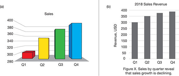
▲Figure 1. These bar graphs are intended to show the 2018 sales revenue to illustrate the fact that sales growth is declining. Although a and b present the same data in similar formats, b provides more information.
Figure 1b contains the same information, but without all the extraneous visuals that carry no information, i.e., colors and 3D shapes. Figure 1b makes it clear that sales growth is beginning to wane. It reveals the true trend because the vertical axis includes zero (every bar graph should), which eliminates the visual exaggeration of Figure 1a. While Figure 1b is not as visually stimulating, it communicates the main point — sales growth is declining in 2018.
While Rule 1 assures that your graph is relevant, Rule 2 and Rule 3 keep the presentation on track and focused. Rule 4 advises using the right graph, as each type of graph is best suited to a particular application (Table 1) (2).
| Table 1. Select the right graph for the information you want to present. Each style of graph is suited to a certain type of application (2). | ||
| Type | Strength | Example |
| Bar Graphs | Comparisons | Sales by year |
| Line Charts | Trends | Growth or decline over time |
| Pie Charts | Relative proportion | Market share by company |
| XY Charts, i.e., Scatter Plots | Relationships between two variables | Effect of temperature on reaction rate |
| Contour/Surface Plots | A response to multiple variables | Product yield as a function of temperature and pressure |
A graph that is good for one thing may be bad for another. Consider the synchronized line charts of Figure 2, which show operating data for a furnace. The graph follows the four rules. The colors serve a purpose, distinguishing the various charts (Rule 1). The graphic fulfills its intention according to the caption, which states that NOx remains below its maximum permitted limit (Rule 2). It is reasonable to presume that the audience understands the legal and moral ramifications of remaining in legal compliance (Rule 3). The chart also shows how several factors vary with time, which is a strength of line charts (Rule 4).
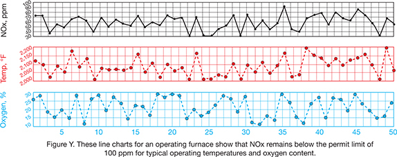
▲Figure 2. According to the caption, the intent of these line charts is to show that NOx remains below the permit limit of 100 ppm under normal operating conditions (i.e., temperature and oxygen percentage).
But, what if you want to show how NOx is affected by temperature and oxygen concentration? Line charts are not as effective at displaying this relationship. Instead, you should use a surface or contour plot (Figure 3). While Figure 3 includes both surface and contour plots for the same data, only one graphic is needed. The contour graph (left) is best if you want your audience to ascertain the exact values of temperature, oxygen, and NOx. However, if you are concerned with highlighting a trend, the surface plot is the better option (right). If your main goal is to show that NOx emissions are in compliance, Figure 2 best serves this purpose.
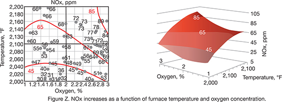
▲Figure 3. Both of these plots show how NOx fluctuates with temperature and oxygen. The contour plot (left) shows the data values, while the surface plot (right) better depicts the overall trend.
Guidance for the accompanying voice-over. No matter how great your graphics may be, they will require an accompanying verbal description. In a body of text, such as what you are reading, there is no opportunity for additional clarification, so every graphic must be able to stand on its own. In a presentation, graphics should still follow the four rules, but can be accompanied with an oral description. Even so, it is still prudent to include a title and caption for all graphics. Including all of the necessary information in the visual is helpful for those with hearing impairments and those who cannot hear you due to poor room acoustics. It can also be beneficial for anyone who wants to review the slides after the presentation.
Tips for the presentation
Fear of public speaking is a common anxiety, but the more familiar you get with doing it, the less anxious you will feel. Rehearsing is a good way to feel more prepared, but that may not be enough for you. Consider joining an organization such as Toastmasters International (3), which provides its members the opportunity to practice public speaking and receive constructive feedback.
My fear of public speaking abated when I began to perform in community theater. For me, it was easier to present someone else’s words. These experiences teach you that no one dies from a less-than-perfect presentation and nearly everyone in the audience is on your side.
Focus on being authentic. Some people like to start with a related and humorous anecdote, but being yourself is more important than being funny or witty. Wit and charm will come naturally if you feel like yourself.
Radio hosts convey 100% of their message verbally, and they can serve as a source of inspiration as you formulate your voice-over style. If you listen closely, you will notice they never use stall words, e.g., ums and ahs. If you catch yourself at a loss for words, stop, think, and then speak. For help with visual presentations, observe television newscasters. Watch their posture, facial expressions, and general demeanor, which are obviously important when your audience can see you, but are also important when you are not on screen. Voice and physicality are connected. Your chest should be up and shoulders back to allow your voice to project. Your facial expressions and gestures enhance the expression of your voice. Preparation and rehearsal will make for a genuinely confident presentation.
For online videos, the quality of the videography is also important. Consider lighting, color balance, angle, and frame. Depending on the formality of your presentation, you may want to hire a professional videographer, allowing you to focus on the content and the delivery.
What to do if you flub
The big day has come, you present, and it goes perfectly. Or, so you would hope. If not, keep in mind that nearly all learning is based on failure and discomfort, and you should consider any flubs your friend, rather than your foe. If you are less than perfect, you will get better. Over time, you will notice that your presentations have become less forced, more natural, and maybe even fun.
Literature Cited
- Tufte, E. R., “The Visual Display of Quantitative Information,” Graphics Press, Cheshire, CT (2001).
- Cleveland, W. S., “The Elements of Graphing Data,” Hobart Press, Summit, NJ (1994).
- “Toastmasters International,”www.toastmasters.org (accessed June 28, 2019).

Would you like to access the complete CEP Article?
No problem. You just have to complete the following steps.
You have completed 0 of 2 steps.
-
Log in
You must be logged in to view this content. Log in now.
-
AIChE Membership
You must be an AIChE member to view this article. Join now.
Copyright Permissions
Would you like to reuse content from CEP Magazine? It’s easy to request permission to reuse content. Simply click here to connect instantly to licensing services, where you can choose from a list of options regarding how you would like to reuse the desired content and complete the transaction.